
On Monday morning our review meeting broke before slide two. Finance called it "$30k waste." Ops called it "redundant architecture." Architecture called it "elastic buffer." One room, three languages, one bill. Numbers did not lie, but naming killed the conversation.

The previous chapters covered first-scan setup, restricted-network stability, weekly execution rhythm, and useful notifications. Part 5 does one thing: turn findings into standardized assets for governance, review, and accountability.
Teams evaluating cloud governance tools usually start from dashboards. We start from taxonomy consistency, because without shared language every trend is debated instead of acted on.
This is where governance either becomes an operating system or turns into expensive decoration. Category semantics must be stable before charts are scaled.
Freeze taxonomy before dashboard polish
Most teams ask for a bigger dashboard first. I recommend the opposite. Freeze the classification dictionary first, otherwise taxonomy drift turns every trend line into noise.
Keep first-level categories small and strict: Idle, Rightsizing, Storage Lifecycle, Network Waste, Policy Risk. Then enforce required fields for each finding:
- category, severity, estimated_monthly_saving
- resource_scope (account / project / environment)
- owner_team, first_seen_at, last_seen_at
- status (open / in_progress / resolved / ignored)
If the semantics are not aligned, your dashboard is theater. If semantics are aligned, even simple charts from cloud governance tools become decision-grade.

Do not treat API as an export button. It is your pulse.
If trend APIs only exist for monthly export, they are dead on arrival. Trend APIs must drive weekly behavior.
Three endpoints are enough to start:
GET /api/reports/trends?from=...&to=...&group_by=weekGET /api/reports/categories?from=...&to=...GET /api/reports/teams?from=...&to=...
Track only what changes behavior: new vs closed findings, closure rate, reopen rate, MTTR, and validated savings versus potential savings.
Put governance into the client, not another reporting island
We debated launching a separate governance portal. I rejected it. Asking teams to open another domain for core decisions is governance tax.
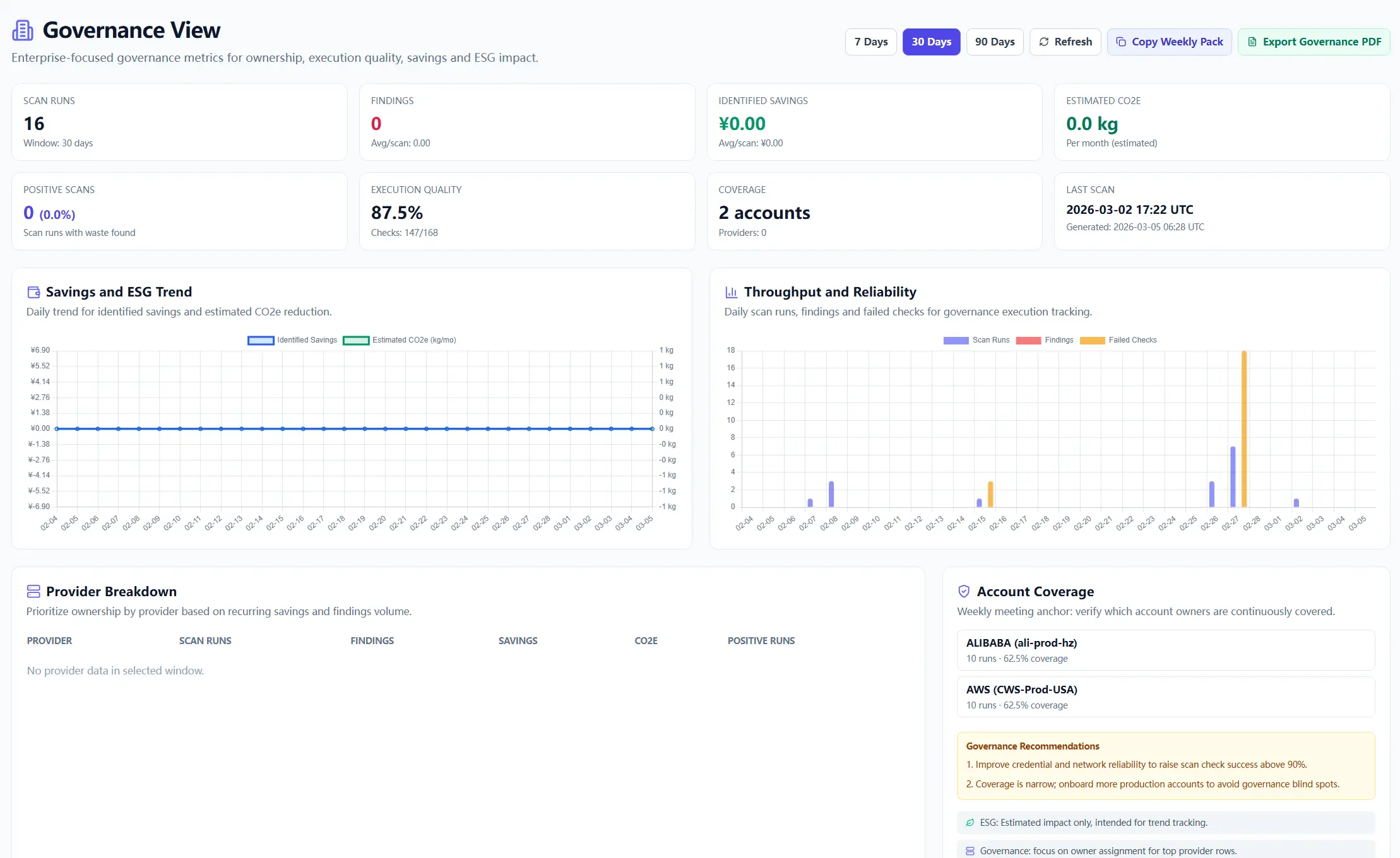
Keep the review inside the client enterprise view so it does not become a detached BI artifact. The minimum layout should contain four blocks:
- Category distribution
- Weekly trend movement
- Team backlog and closure
- Recurring findings queue
Use one weekly format and never improvise structure
Limit the weekly review to four decisions:
- Top three categories by financial impact
- Top three team backlogs by risk
- Closure rate delta week-over-week
- Recurring findings moved into policy-level remediation
Governance is not a louder meeting. It is a stable operating rhythm.
Next in the series
Continue with Part 6: Weekly Operating Playbook with Current Features. It focuses on getting weekly governance outcomes with current workflows, clear ownership, and trust-first local-first operating habits.
Make cloud cost optimization measurable, not debatable
Use the taxonomy to make one trend report easier to explain before widening the API workflow.